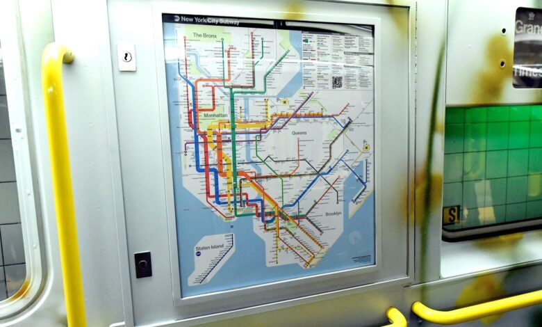
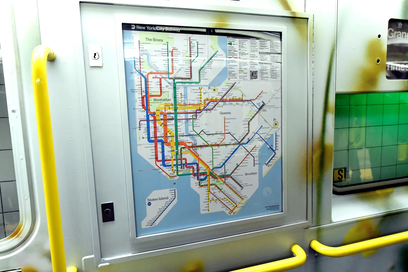
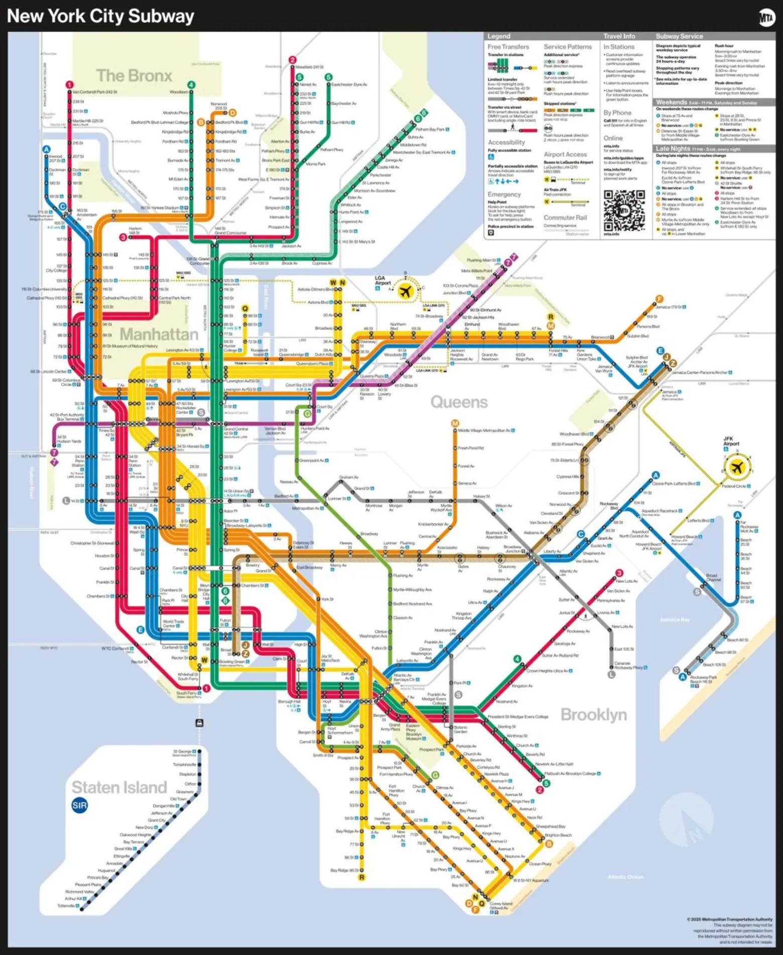
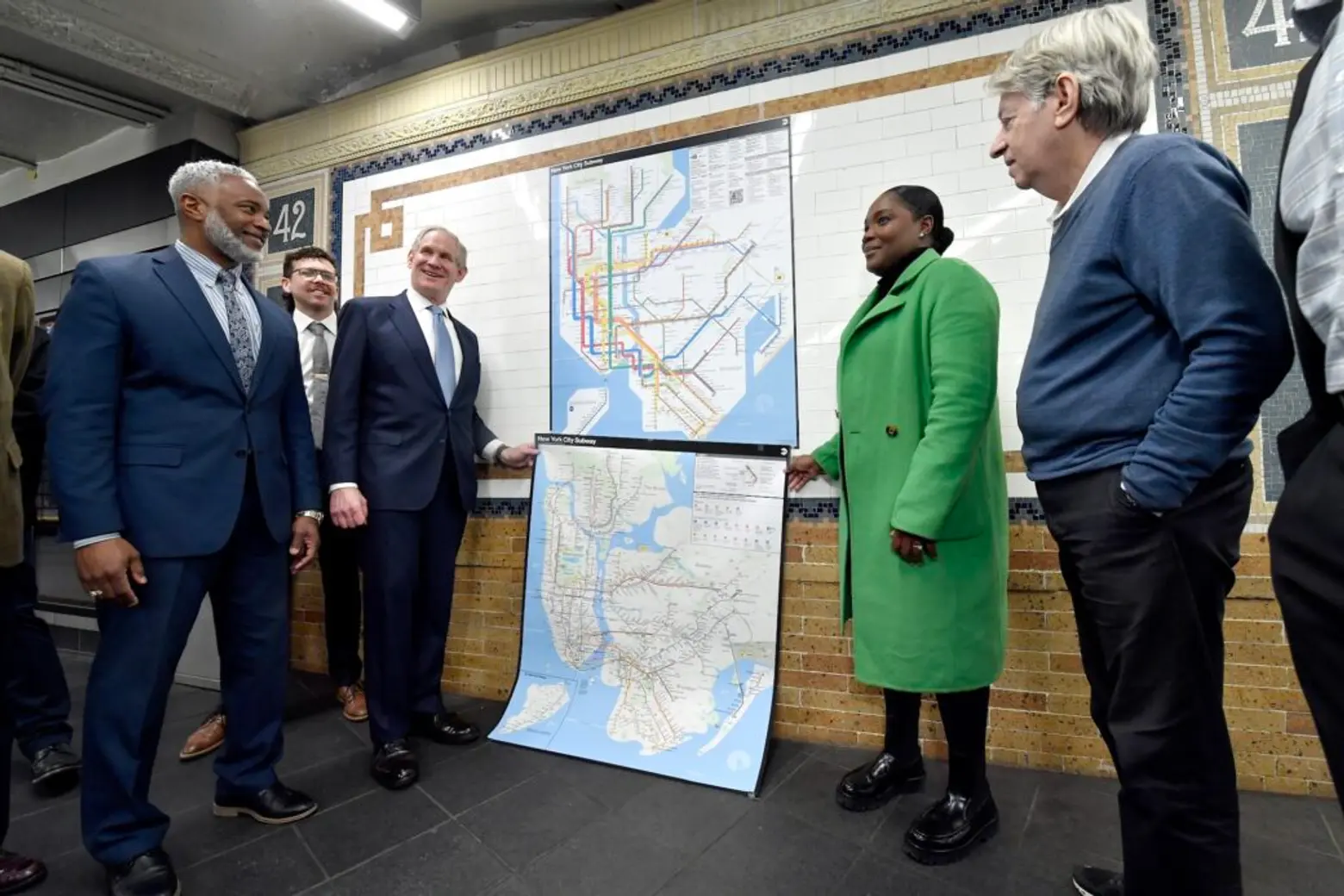
The official New York City subway map has received a major makeover for the first time in 50 years. The Metropolitan Transportation Authority on Wednesday unveiled the redesigned map, which features bolder colors and straighter lines, a simplified display that hearkens back to Massimo Vigenlli’s iconic 1972 map. The updated map, which first appeared on digital screens throughout the system last fall, also offers more precise information on transfers and has an easier-to-read legend.
“The new MTA is focused on a quality, 21st century customer experience, and its about time our map caught up,” MTA Chair and CEO Janno Lieber said. “The new version is much easier to read while also reflecting all the enhancements we’ve made over the years.”
Designed by the MTA’s Creative Services Mapping Department, the new map presents essential travel information in an easily readable, bright, and organized manner, according to the agency.
The map uses a diagrammatic style similar to other major subway systems around the world, featuring bold, straight lines that are easy for the eye to follow and better for digital users. Additionally, the use of a white background, horizontal writing, and black dots make the map ADA-friendly, especially for individuals with visual or cognitive disabilities.
The designers prioritized text legibility by keeping text on a single line and optimizing open space to avoid crowding. They also used black subway bullets with white characters to enhance contrast and improve visibility, according to a press release.
The map’s legend now includes accessibility, transfers, and safety information, as well as a QR code that brings users to the MTA’s website. The transit agency says it used feedback from the public and focus groups to inform the new design, as reported by PIX11.
“The subway map is both an iconic symbol of New York and a tool that everyday riders and first-time users of our system use to get around,” NYC Transit President Demetrius Crichlow said. “This modern redesign makes it easier to navigate the system – especially during service changes – and has a quintessential New York look that riders will appreciate for years to come.”
When the subway first opened in 1904, maps were simple diagrams that depicted individual subway companies, such as the Interborough Rapid Transit Company (IRT), the Brooklyn-Manhattan Transit Company (BMT), and the city-owned Independent Subway System (IND).
In 1940, these companies were consolidated under city control, but the streamlining of transit information and signage lagged behind. This caused confusion among commuters and motivated the city to develop a new, unified map, according to the NY Transit Museum.
In 1957, graphic designer George Salomon sent an unsolicited proposal to the city’s Transit Authority (TA), highlighting the issues caused by the merger of the three transit companies. He presented steps to make navigation easier, leading to the creation of a system map that was used through the 1960s.
Salomon’s was the first map produced directly by the Transit Authority and the first to incorporate a “Beckian grid,” named after Harry Beck, who standardized the London Underground map using 45 and 90-degree angles, according to the transit museum.
In 1972, Massimo Vignelli redesigned the subway map in a bold but controversial style. While some praised its “rigor” and “ingenuity,” many New Yorkers criticized it for distorting the city’s geography. Central Park appeared as a square, the surrounding water was colored beige, and some stations were in the wrong locations, according to the New York Times.
Vignelli had sacrificed “geographical accuracy” for clarity, presenting the city’s maze-like subway system in a neat diagram, as reported by the Times. In response to criticism, Michael Hertz designed a new, more geographically accurate map in 1979. The layout of that map has been used in various iterations ever since.
In 2020, the MTA introduced its first real-time digital subway map, which updates using data from the transit agency to show service changes as they are happening. Users can click on stations and train lines to view the accurate wait times for the next train.
Created by Work & Co., the map blends elements of Vignelli’s 1972 design and Hertz’s design, combining Vignelli’s geometric, graphic design-focused style with the geographical elements of Hertz’s map, as 6sqft previously reported.
Similarly, the new map draws inspiration from both Hertz’s and Vignelli’s designs, using the official brand colors of the Hertz maps and incorporating a geometric, “diagrammatic aesthetic” similar to Vignelli’s.
RELATED:
Get Insider Updates with Our Newsletter!
Source link


